Note: click on the images to see a larger image.
Parti Circulation and Structure

Circulation
The concept of the circulation is based on the two different experience you get when walking through the walkway of the house: the stairs. It could be experienced through two different ways, where the first one is the main stairs for the owner and guests. I used thick lines to reveal the path, so you can see how the path leads you to the entrance. You then arrive in a room(office), where there’s a stair leading somewhere, but there is a sharp turn that hides the view in behind, where on the diagram you can see how the stairs is drawn in a lighter tone, which shows the fact that you cannot get behind the stairs unless you are invited by the owner.
After you are invited and go up the few steps, the space suddenly becomes open again, where the main stairs leads you to almost everywhere. An interesting insight of the stairs is that the openings of the public areas are placed at a turning point, therefore the stairs has become a device guiding you to see different views, even you are just walking by and not actually going inside that room. I put certain details on the public areas of the parti to show that how it feels like when a person is walking pass and seeing the room through the opening, where the other places are still omitted because he/she is not going inside.
The service stairs, on the contrast is very direct and straight. This is mainly because these stairs are for the servants and they need to get to different floors as quickly as possible to serve their masters.
Structure
The main load bearing walls of the Villa are the exterior walls, which is common for a modern architecture. Moreover, as there are a lot of level differences, internal load bearing walls are needed. Therefore, an interesting pattern of walls are created on the plan.
Parti Enclosure

Enclosure
What I first think of Villa Muller is a rectangle box. However, through analysing the building, (Justin and) I found out that the openings on the North side (where the main rooms are) are generally large, which gives a beautiful view down the hill to the city of Prague. You can see how the openings on the North(facing the slope) are drawn bigger and placed on every level in the parti, where the South side has only small openings. This express how the views and amount of light is fewer for the servants, where the main working area is on the South side of the house. The enclosure parti has also inspired me of the porche drawing because of the large openings and different amount of light it gets on different ends.
Parti Program and Geometry

Program
Villa Muller was a building built for both an office and a home, therefore it has a clear definition of public and private space. I used different shades of hatching to represent how the different levels of privacy is experienced throughout the house. Through the office( the least hatched) you proceed into the invited living area (a bit more hatched), and further up you will get to the more private bedrooms (most hatched), where the highest level is the terrace, which goes back to a invited public place.
The site plan also shows how the building relates to the outdoor space, where the garden is large and opened, contrast to the relatively small and enclosed villa.
Geometry
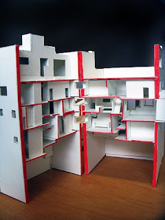
As I said in the WIP post, I thought the plans of this villa is very complicated. However, when I researched more about this building, I found out that the geometry was actually very simple: the plan is divided into six small squares, where each square indicates an element(room) in the building. It then forms a simple grid system, which greatly clarifies the spaces. Moreover, we cut the section coincidently through the grid line, the model actually shows how the system works, where this will be explained later in the model.
Poche Section

Through the enclosure, I know how the North side of Villa Muller is brighter than the South side, therefore I tried to make the South side darker then the North side. You can see how the light get into the main rooms, where the South rooms are generally dark.
…That’s what I meant to draw, but it seems the drawings didn’t really show the difference between the light and dark. I know about this problem a long time ago, and I always wanted to improve it. However it didn’t went very well, because I always think that I drew dark enough, but it isn’t.
Poche Plan

The same idea of light and dark is again put in the plan poche. This time I tried to add some more details to it, such as furniture and tiles in the kitchen. This time the contrast between the light and dark is better, but some places, such as the secret room in the middle which is generally darker still needs to be improved and drawn darker.
Model
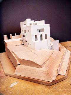
The base is loosely joined, which is made removable in order to take the model out.
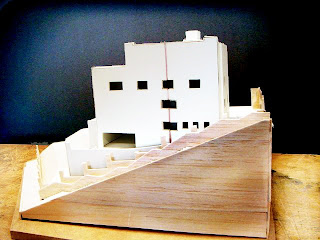

How it looks like when the base is removed and the section is pulled out.
The section line is painted red in order to clarify the plane that is cut out.

From the short section, the different level height is shown clearly.

From the geometry, we know how the building is created by grids. From that idea, we made our plan pull-able, so that a single segment(square) could be examined, such as the room structure, how different walls and components join together etc.

Reflection
Through this project, I really learnt a lot in how to analyse a building through separating it into different elements. The poche gives me the idea of how the building is when somone is living in it. It also gives me an understanding of how the sunlight passes through windows and casts shadows(although I have to work more on it, I know how it casts but its hard for me to draw the different shades of darkness…my weakness was always this, and I surely have to improve it)
However, I don’t think I did a really good job in this project, mainly because of the time. I thought Justin and I already started to do the model early(well at least I did the rough model on Week 2!), but because our group only have two people doing Villa Muller(where others usually have three), we ended up like other groups who are doing last minute work, which I hate the most.
Moreover, I would like to use a little space here to thank my partner Justin who tolerates me a lot, and accepts my stupid ideas(such as using whitecard where we both have no experience on this material, and making the plans pull-able). THANKS JUSTIN!!


